
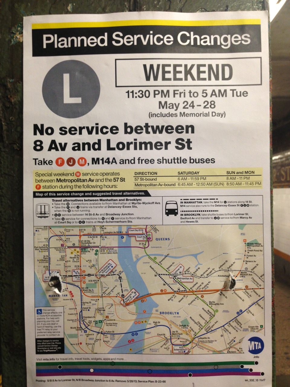
Dear MTA Service Change Poster Announcement Designer:
I know you’ve probably heard this before, but we need to talk. Maybe you’re overworked. Under-payed? Maybe this isn’t in your primary job function? Maybe this is beneath you? Above you? Maybe you’re just too close to the system? Maybe you’ve been making these for too many years to see them with fresh eyes?
Yes? No? Either way, we’re here to help! I bet we can all work together to come up with a design that is actually understandable. To a human being. Who hasn’t lived here a couple years. We are one of the greatest cities in the world, if not *the* greatest, surely we’re not lacking the talent!
So, New York/world/tumblr, can we please create a contest, or something, to design a better format for these? Like what the city did for the parking signs. That was an improvement!
I’d be willing to put down $100 towards the prize, as a start. I’d also be willing to spend hours wading through submissions to then present to the MTA.
Any takers?
Sincerely,
Confused Commuter Man
PS. I have not researched this post and expect your numerous links to times this has been addressed in the past. Including any reasons why it’s still so awful. Feel free to link in the comments/reblogs. :)
PPS. Related, I wonder if the MTA has a style guide for these.